We are Kaingaroa Tipu
Kaingaroa Tipu is our new single unified brand for Kaingaroa Timberlands, Timberlands, and Forest Genetics. Our brand is a simple, engaging and true expression of who our company is and what it does. It has three elements:
Kaingaroa
Retaining ‘Kaingaroa’ in our name honours the legacy of the past. We have kept this word at the heart of our name to acknowledge and remember our shared past, and the many people who contributed to the magnificent forest we know today.
The ‘big K’, the main focus of our brand, it is a reflection of our commitment to sustain and enhance this living ecosystem for future generations.
Tipu
The ideas of ‘growing’ and ‘growing better’, and doing so in a step-by-step way, surfaced early and frequently across many conversations, as the story developed.
Tipu has a range of meanings, expressing dimensions and characteristics of growth across all facets of life and our business.
The T is understated, and takes a back seat to the positive form of the K.
‘We grow better, every day’
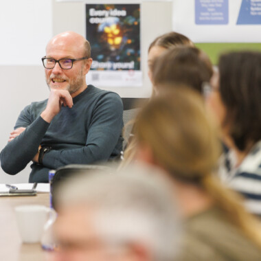
We: the company has a collaborative and collective culture - centred on people and partnering
Grow: the many dimensions of growth that underpin our story.
Better: a commitment to step-by-step, balanced, constant improvement. From ‘being the best’ to a culture focused on doing better, always.
Every Day: every day draws on the natural rhythms of daily, seasonal, and commercial cycles that shape how we live and work. And a commitment to improvement with every step the team takes.
Our Brand Story
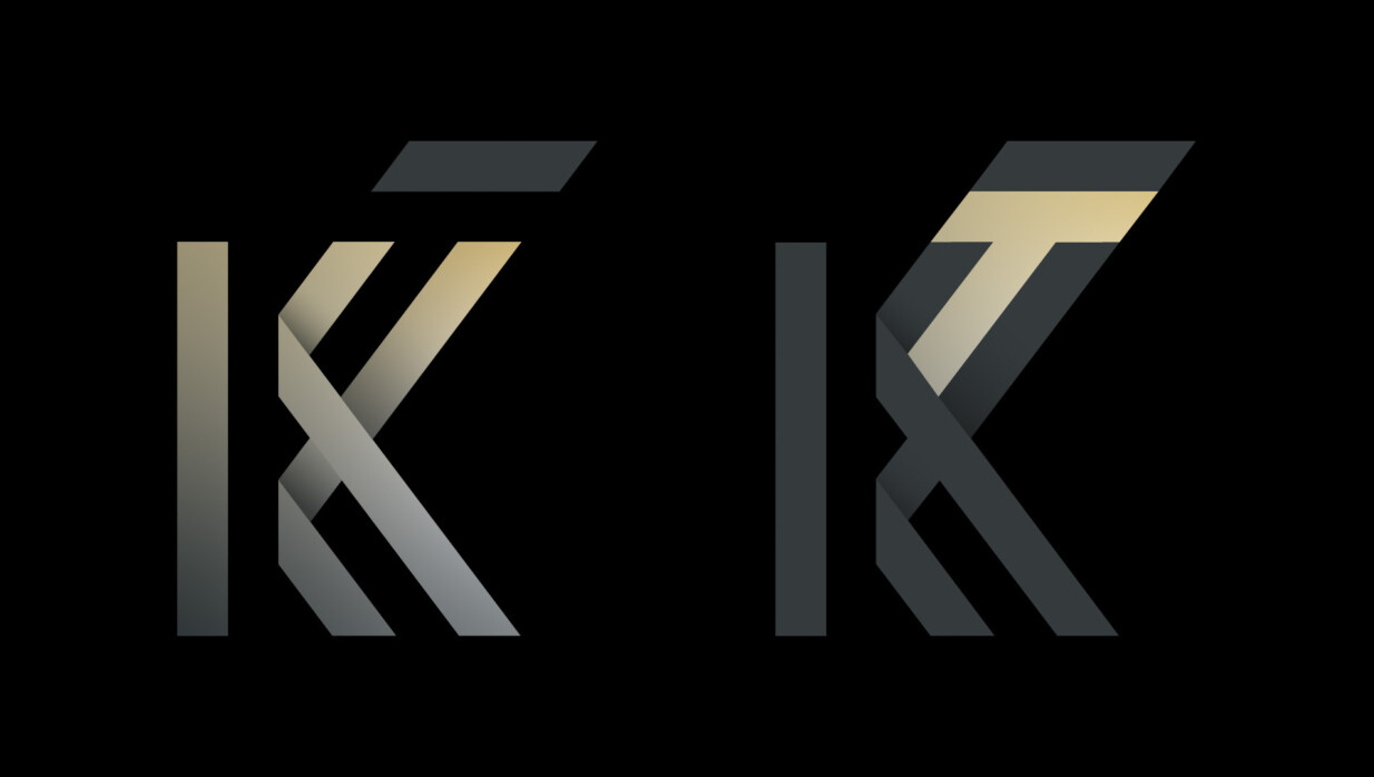
The meaning of KT
K - for Kaingaroa
The ‘big K’, the main focus of our brand, a reflection of our commitment to sustain and enhance this living ecosystem for future generations.
T - for Tipu
Tipu as the modifier of Kaingaroa, the commitment, energy and value we bring. It represents the increasingly sustainable way we work - the steps we take to grow better every day. The T is understated, and takes a back seat to the positive form of the K.
KT - Kaingaroa Tipu
Kaingaroa and Tipu, in healthy symbiotic balance. Sustaining and enhancing each other’s existence with positive and negative forms.
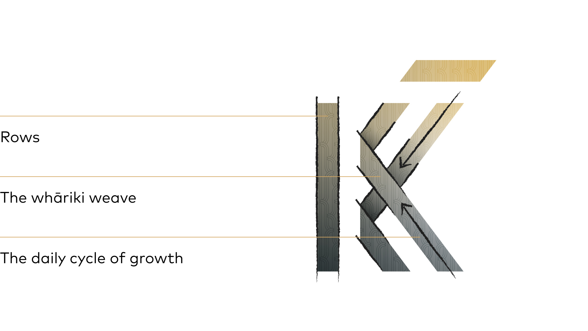
The meanings within our logo
Rows
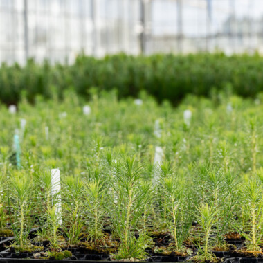
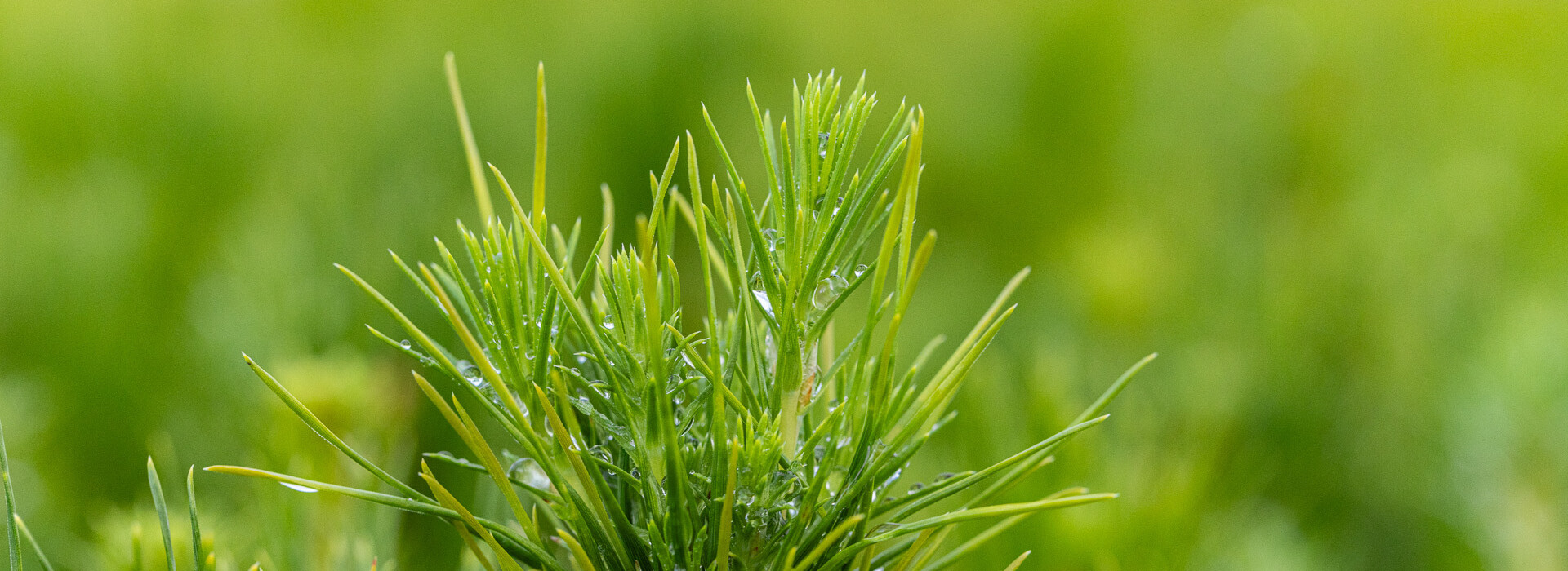
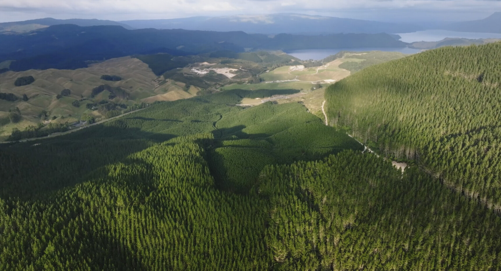
A single stem represents generations of the forest and vast ordered rows of trees nurtured from seedlings further than the eye can see.
The whāriki weave
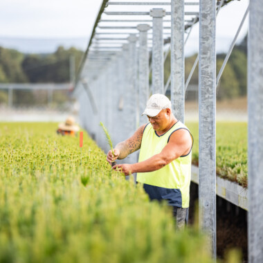
At our heart is partnering, the interconnection between the environment, forest and people.
The daily cycle of growth
Growth from the sun’s energy combines with the natural abundance of the ecosystem. Our careful management ensures growth and wellbeing are in a constant healthy balance.
Our patterns
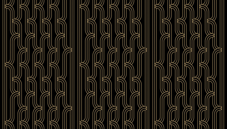
Whakarare - inspired pattern
Our patterns were designed by Māui Taewa – carver, artist and graphic designer.
This design is inspired by a pattern called whakarare. This pattern symbolises the innovation in our work, modifications that have been made over generations past, and into the future, that help us to grow better.
“Within the pattern the vertical alignment of the trees and the grain signifies continuity and consistency.”
“Growing in unity: the different networks of families and of generations who have worked there. The life cycles of the forest itself.” - Māui Taewa.
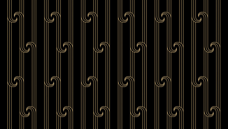
Whakairo inspired pattern
This pattern is inspired by the style of carving (whakairo) and represents partnering. The lines represent navigation like that of a canoe piercing through the waves, processes, moving as one.
“The spirals represent new beginnings, new start to life and new opportunities. The double spiral also depicts partnering, connections, mutual agreement, unity and whānaungatanga.” - Māui Taewa.